paliienko.com

Header

Coupe-Coupe.

Logo Design, Brand Identity, (june 2024)

Love is in the hair!

“Coupe-Coupe” is an existing hair salon in Vevey. This project is completely imaginary, names are created. I was interested in recreating the brand as I possibly see it. Below you can see a format of a brand presentation I used for showcasing the process.

The result is a reimagined brand identity that celebrates the salon’s commitment to natural ingredients, while incorporating a playful, whimsical touch inspired by the beauty of nature.
Coupe Coupe - About The Brand

ABOUT THE BRAND

Coupe Coupe is Vevey's eco-chic hair salon for natural beauty enthusiasts. We're not just cutting hair; we're cultivating confidence through slow beauty rituals and earth-loving products. Our personalized pampering unleashes your inner goddess, making your hair – and spirit – bloom. At Coupe Coupe, we believe when you embrace your natural allure, you become unstoppable.

NATURAL
MINDFUL
FEMININE
EMPOWERING
Smiling woman with curly red hair Stylist working on client's hair
Hair styling tools on wooden surface Group of women in white outfits

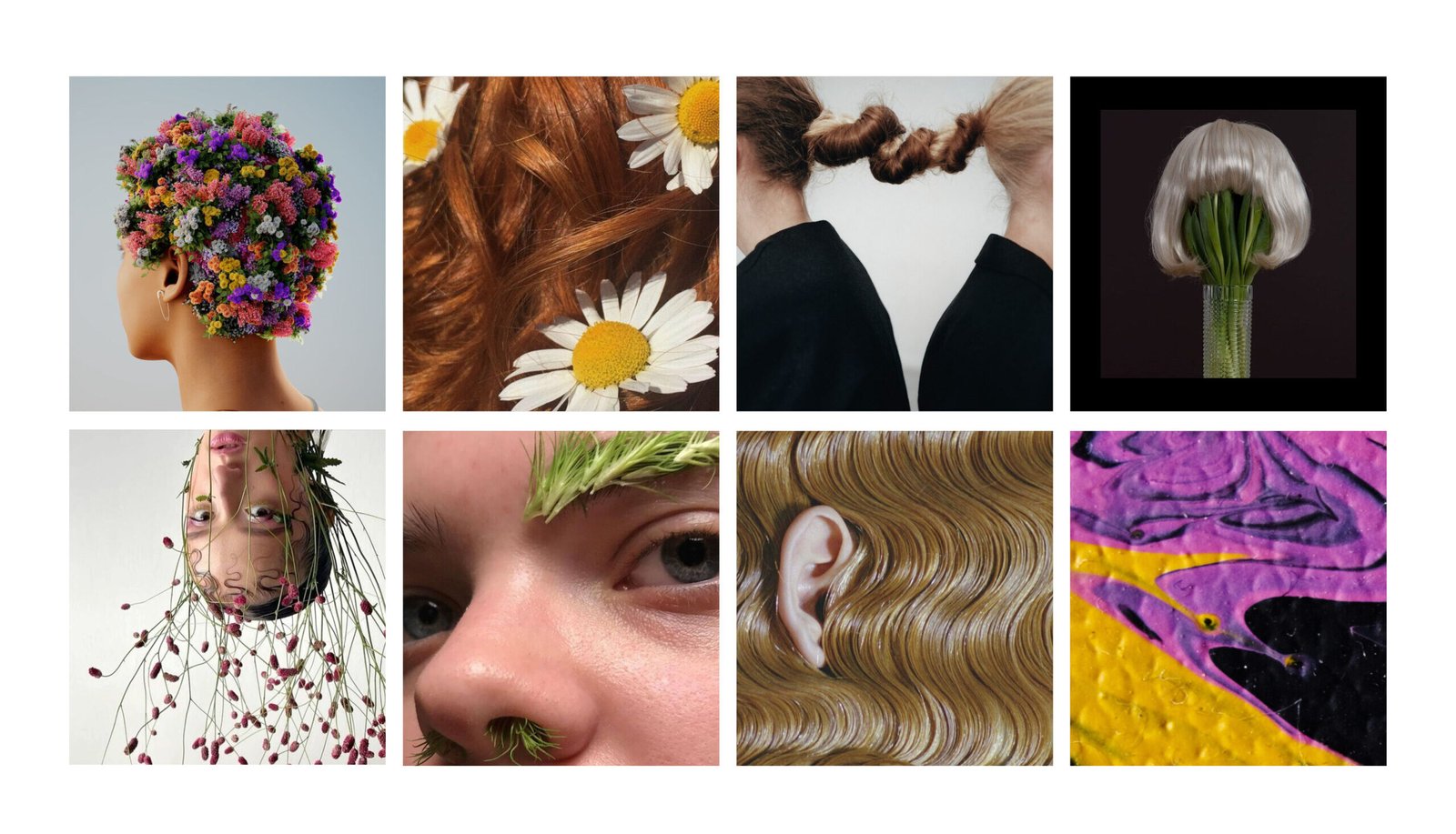
MOODBOARD

Our moodboard captures Coupe Coupe's essence through raw, natural imagery. From flower-crowned heads to grass-lashed eyes, each photo embodies our eco-chic ethos. We've eschewed logos and illustrations, letting nature's beauty speak for itself.

DIRECTION

Flower power: Celebrating nature's vibrant palette

Feminine strength: Nurturing inner and outer beauty

Organic purity: Harnessing plant-based potency

Slow beauty: Prioritizing long-term hair health

Mindful glamour: Emphasizing care over trends

Image of a flower arrangement, representing Coupe Coupe's connection to nature. Image of a woman with braids adorned with flowers, showcasing a natural hairstyle. Close-up image of a woman with flower petals on her face, emphasizing natural beauty. Image of a woman with a flower crown, representing Coupe Coupe's feminine aesthetic. Close-up image of a woman with flowers around her eye, highlighting natural details. Image of a woman with flowers in her hair, representing Coupe Coupe's connection to nature. Close-up image of a woman's nose with a flower decoration, emphasizing natural beauty. Image of a woman with a flower tattoo, representing Coupe Coupe's artistic approach. Image of a woman with floral body art, showcasing Coupe Coupe's creative style.
Coupe Coupe - Primary Logo

PRIMARY LOGO

Our moodboard captures Coupe Coupe's essence through raw, natural imagery. From flower-crowned heads to grass-lashed eyes, each photo embodies our eco-chic ethos. We've eschewed logos and illustrations, letting nature's beauty speak for itself.

Coupe Coupe - Primary Logo

PRIMARY LOGO

Our moodboard captures Coupe Coupe's essence through raw, natural imagery. From flower-crowned heads to grass-lashed eyes, each photo embodies our eco-chic ethos. We've eschewed logos and illustrations, letting nature's beauty speak for itself.

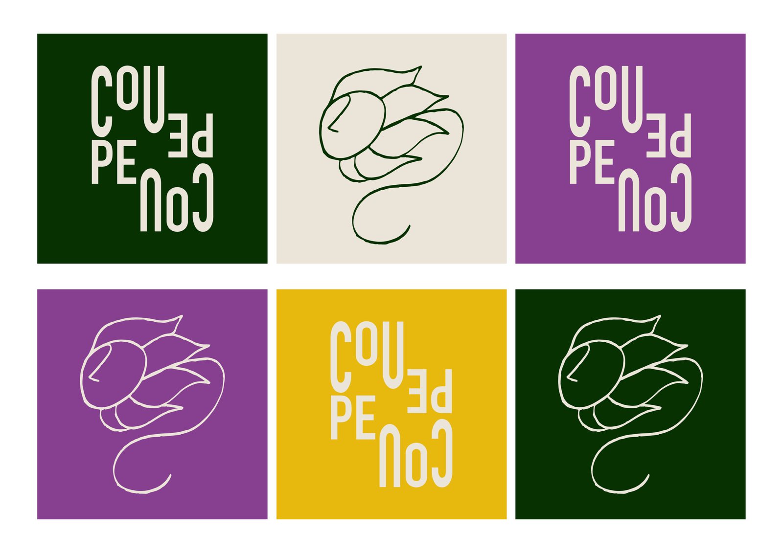
Coupe Coupe Logo

Layered Meaning: The overlapping and intertwining of letters visually represents the French word «couper» (to cut). This clever design subtly communicates the salon's core service while adding depth to the logo.

Dynamic Typography: The staggered arrangement of letters creates a sense of movement, mirroring the dynamic nature of hair styling. This unconventional layout reflects Coupe Coupe's innovative approach to beauty.

Bold Simplicity: The stark contrasting colors scheme and clean, sans-serif font exude modern elegance. This minimalist approach allows the logo to be versatile and memorable, embodying Coupe Coupe's commitment to timeless style.

Coupe Coupe - Primary Logo

CONSIDER TO

Use for official documents, signage, and main storefront.

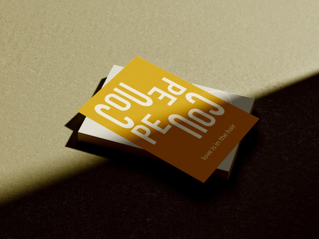
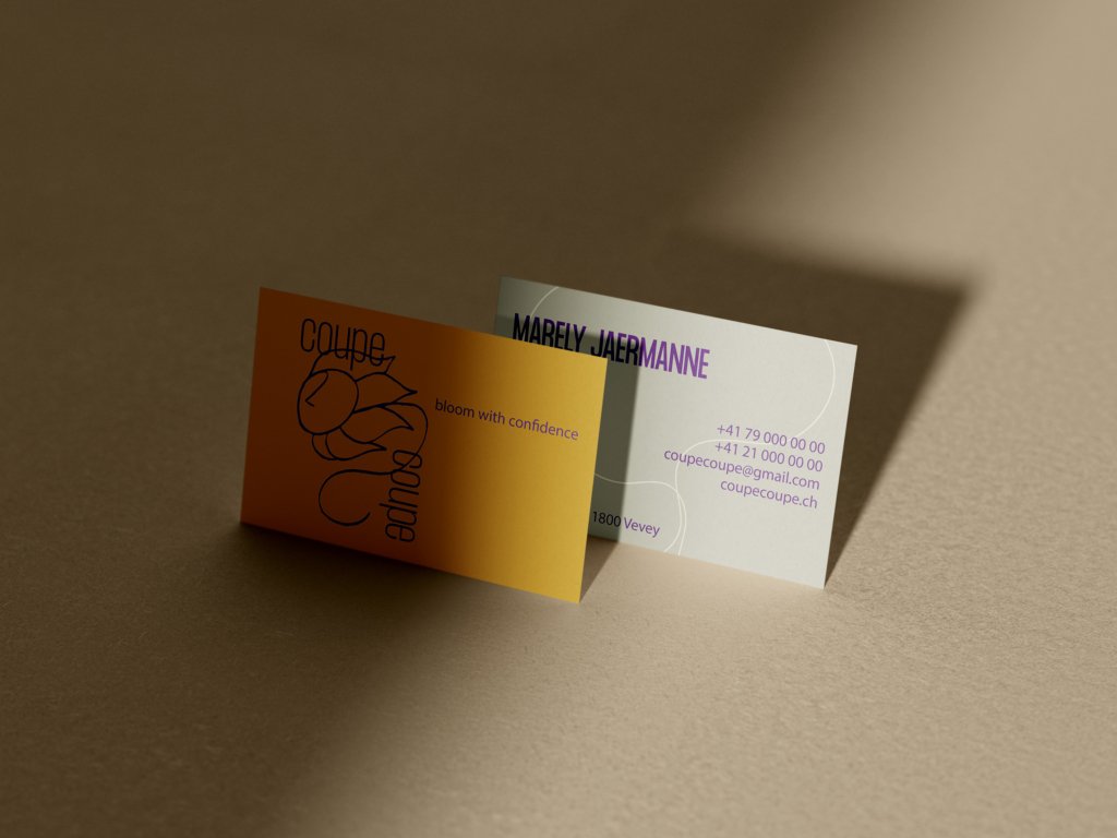
Apply on business cards and promotional materials.

Incorporate into website headers and social media profiles.

Coupe Coupe - Primary Logo

SECONDARY LOGO

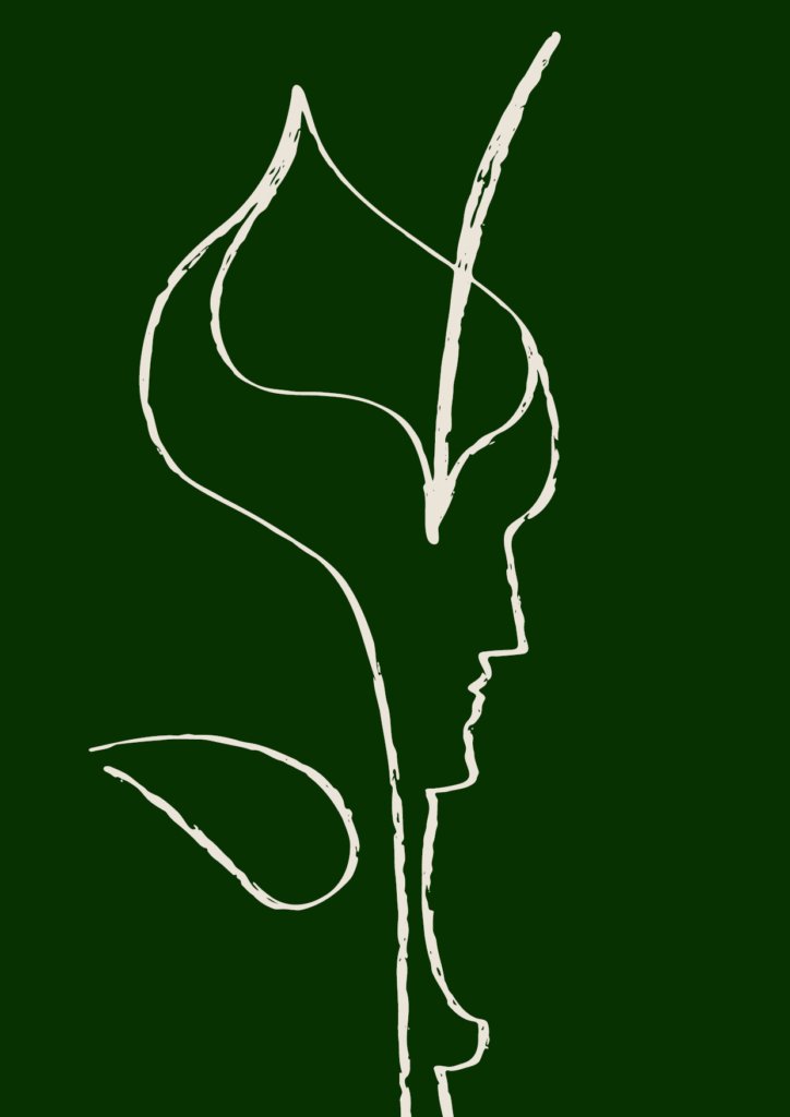
This logo is the artistic flourish that complements your primary identity. Like branches and flowers growing from a sturdy trunk, it adds depth and creativity to your brand. Use it to infuse your materials with a touch of organic beauty and artistic flair. This logo brings to life the natural, flowing essence of your salon's philosophy, softening and enhancing your overall brand presence.
Abstract Portrait: The design cleverly suggests a stylized face or head, with flowing hair or perhaps a floral element. This illustrative approach captures the essence of beauty and transformation central to the salon's mission.
Artistic Flair: The hand-drawn quality of the illustration adds a touch of creativity and uniqueness, aligning with Coupe Coupe's innovative and personalized approach to hair styling.
Versatile Simplicity: Despite its artistic nature, the logo maintains a clean, single-line design that's easily adaptable for various applications, from signage to social media icons.
Organic Flow: The continuous line illustration creates a fluid, organic shape that evokes the natural curves of hair and the graceful motion of a stylist's hands. This reflects Coupe Coupe's emphasis on working with natural beauty.
Coupe Coupe - Primary Logo

CONSIDER TO

Use as a favicon or app icon.

Apply as a watermark on images or videos.

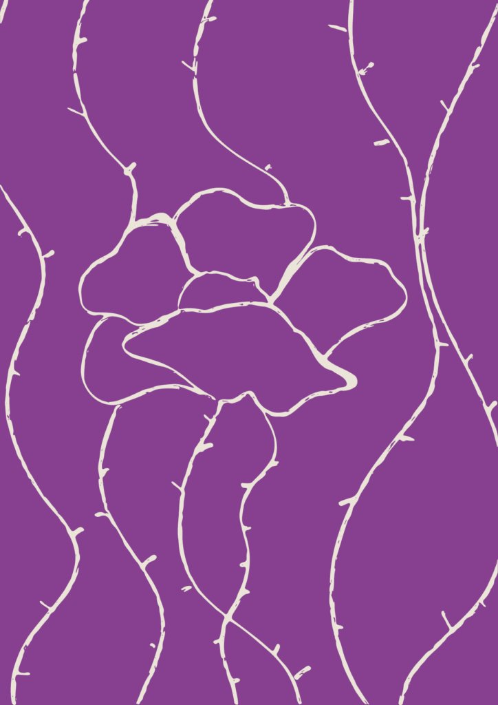
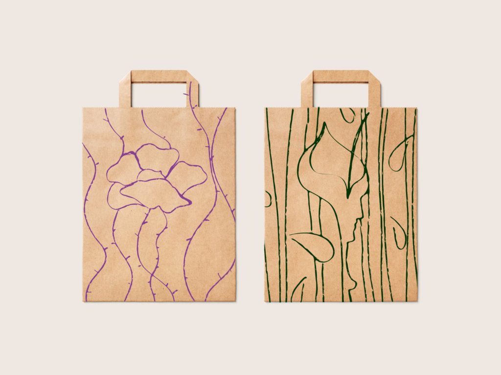
Incorporate into packaging designs or product labels inside a floral pattern.

Font Strategy

FONT STRATEGY

Simplicity: By limiting to two carefully selected fonts, we maintain a clean look across all brand materials.

Recognition: Consistent use of these fonts will strengthen brand recognition.

Versatility: They are enough contrast to create visual hierarchy without overwhelming designs. We can achieve variety through weight and size adjustments rather than introducing additional typefaces.

Focus: With fewer elements to manage, we can focus on perfecting the use of these fonts, ensuring they always complement our message and aesthetic.

Timelessness: A streamlined font selection helps future-proof our brand, avoiding trends that might quickly date our look.

PRIMARY FONT

Formula Condensed

This font brings a contemporary edge to our brand, reflecting the cutting-edge nature of our hairstyling techniques and products. Its bold, condensed form makes a statement, much like our brand's emphasis on empowering women through beauty.

abcdefghijklmnopqrstuvwxyz

ABCDEFGHIJKLMNOPQRSTUVWXYZ

0123456789

SECONDARY FONT

Futura Light

Complementing this font grounds our communication in clarity and timelessness. Its geometric shapes echo the natural forms found in the flowers and nature that inspire our brand, while its clean lines ensure our message is always clear and accessible.

abcdefghijklmnopqrstuvwxyz

ABCDEFGHIJKLMNOPQRSTUVWXYZ

0123456789

Coupe Coupe - Primary Logo

FONTS

IN ACTION

Formula Condenced should be used for the most titles to tie in the branding and create instant impact.

Futura should be used for the body copy/descriptive text due to it’s perfect legibility.

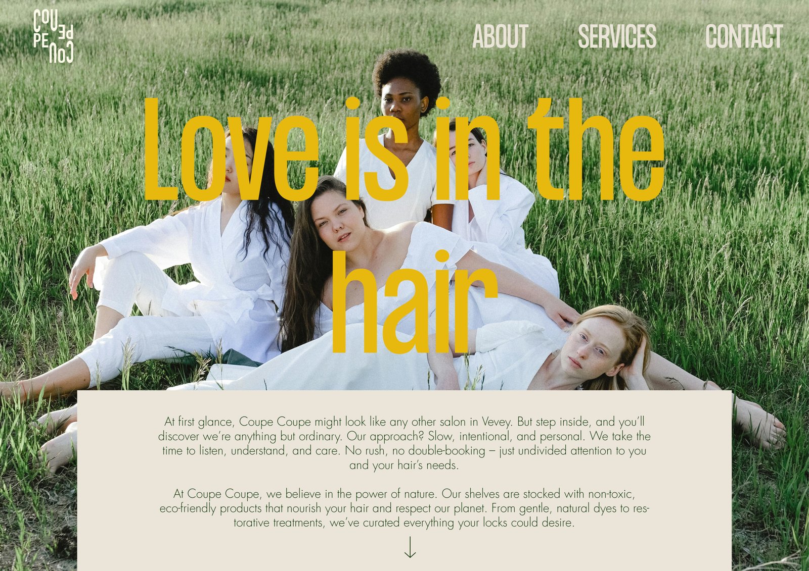
Love is in the hair

Love is in the hair

At first glance, Coupe Coupe might look like any other salon in Vevey. But step inside, and you'll discover we're anything but ordinary. Our approach? Slow, intentional, and personal. We take the time to listen, understand, and care. No rush, no double-booking – just undivided attention to you and your hair's needs.

At Coupe Coupe, we believe in the power of nature. Our shelves are stocked with non-toxic, eco-friendly products that nourish your hair and respect our planet. From gentle, natural dyes to restorative treatments, we've curated everything your locks could desire.

Dark forest

This deep, rich green evokes the mystery and depth of ancient forests. It represents the brand's connection to nature, grounding, and natural beauty. This color symbolizes growth, renewal, and the timeless beauty found in the heart of nature.

Galliano

A warm, golden yellow that radiates positivity and energy. This color represents the sun, vitality, and the blooming of flowers. It embodies the brand's inspiration from nature and its aim to bring out the radiant, confident beauty in every woman.

Vivid Violet

This vibrant purple hue captures the essence of flower power and feminine energy. It symbolizes creativity, imagination, and the bold spirit of women. This color adds a touch of royalty and mystique to the brand.

Pale Cream

A soft, delicate shade that brings to mind the gentle petals of wildflowers. This color represents purity, simplicity, and the natural beauty of women. It's a nurturing tone that creates a sense of comfort and elegance, perfect for highlighting the brand's focus on enhancing natural beauty.

Coupe Coupe - Primary Logo

IllUSTRATIONS

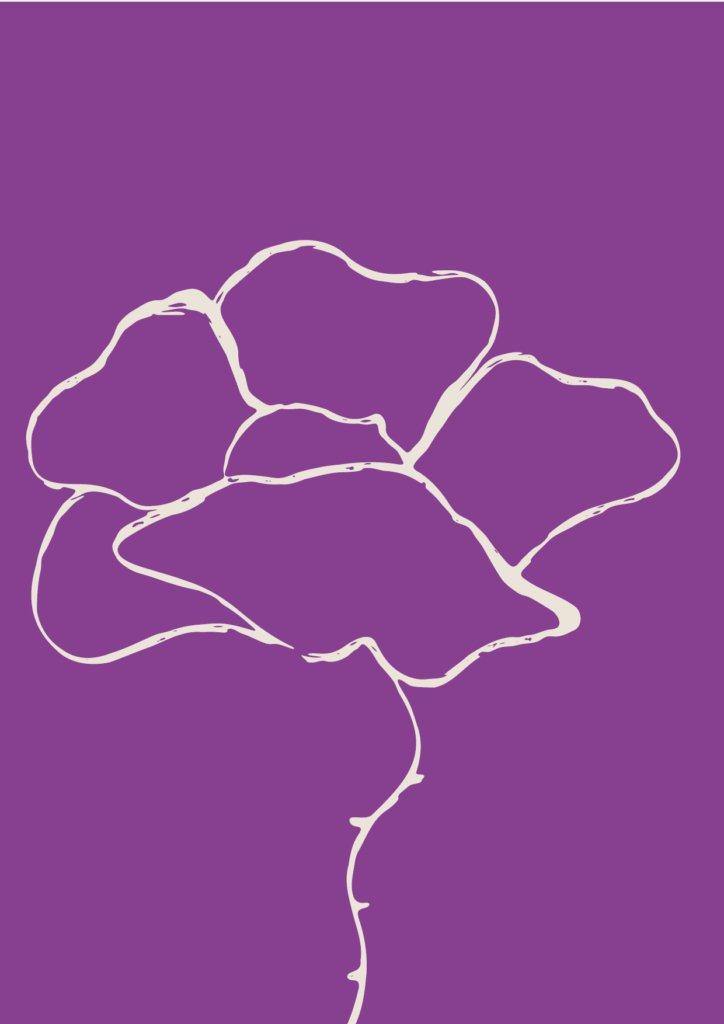
Our illustration style for Coupe Coupe embodies the essence of natural beauty and artistic hair design. We’ve created a series of minimalist, line-art illustrations that blend floral elements with subtle facial profiles, symbolizing the harmony between nature and personal style. legibility.

Coupe Coupe - Primary Logo

KEY ASPECTS

Simplicity: Clean, continuous line work creates elegant and easily recognizable forms.

Duality: Each illustration cleverly combines botanical shapes with human profiles, representing the fusion of natural elements and individual beauty.

Versatility: The designs work beautifully in both single-color and two-tone applications, allowing for flexibility across various branding materials.

PHOTOGRAPHY STYLE

The photography style embodies a natural, authentic feel with a touch of artistic flair. It emphasizes real people, genuine moments, and the craft of hairstyling.

KEY ASPECTS

Lighting: Soft, diffused natural light or warm studio lighting to create an inviting atmosphere

Composition: A mix of close-up detail shots and wider environmental portraits

Color grading: Slightly muted tones to enhance the natural, eco-friendly brand image

Subjects: Diverse models representing various hair types and styles

Settings: In-salon shots as well as outdoor natural environments

Smiling woman with curly red hair Stylist working on client's hair Hair styling tools on wooden surface Group of women in white outfits

SOCIAL MEDIA

The Instagram layout showcases a cohesive and visually appealing grid that balances product shots, client portraits, and lifestyle images. The color palette focuses on earthy tones with pops of vibrant colors, reflecting Coupe Coupe's natural and eco-friendly ethos.

KEY ASPECTS

Diverse representation in model shots.

Behind-the-scenes glimpses of hair coloring and styling processes.

Product highlights featuring eco-friendly packaging.

Inspirational text overlays using a bold font.

Image 1 Image 2 Image 3 Image 4 Image 5 Image 6 Image 7 Image 8 Image 9